HubSpot’s Ebook on Visual Content Creation for Marketers, focuses on creating awesome content for blog and social media platforms. Freely available tools are suggested, and valuable tips offered, allowing the reader to get up to speed quickly and implement their digital marketing strategy effectively.
The book also emphasises the pivotal role played by visual communication in the information age by highlighting best practices. Marketers are encouraged to assume a more proactive role in the design process. And even those without previous graphic design or photographic training are empowered to generate relevant and compelling visual content.

Common Touchpoints
The book deals with creating marketable and consumable visual content. I’ll try to justify why I find this to be interesting, and relevant to the MeCiT study unit
Digitalisation and the move towards an experience economy (Pine & Gilmore 2011, 30–36) has huge implications for society. As a result, this megatrend has had a huge impact on the nature of marketing and tourism products in recent years. Considering this, I believe the authors address the issue by allowing the reader to view the subject from the consumer’s perspective. This may not be immediately obvious. It might even be an unintended bonus. But by the end of the book, the design ideas gained further relevance when viewed through the eyes of a visiting customer.
For instance, combining visual elements with text, in clean and concise layouts is highly compatible with our busy, tech-savvy consumer lifestyle. Clear and targeted visual messages also integrate well with realtime technology. Think SEO, for instance.
In short, I believe the design techniques and strategies recommended in the book are highly customer centric. This also embraces the subject of customer value, a core concept throughout my previous marketing studies.
Key Takeaways
Marketers should give more attention to the use of visual media. The authors provide compelling arguments why.
These include:
- Standing out in a sea of Internet images and shrinking attention spans
- Organising a central image library as a shared company resource
- 10 Commandments of DIY Design
Let’s check them out in more detail.
1. Stand Out and Grab Their Attention
Chapter 1 of HubSpot’s visual content creation for marketers book suggests ways to increase customer interaction. Moving away from generic images, for example. Targeting customer lifestyles and desires with visually appealing content yields advantages over the use of traditional product promotion. Hence, customer engagement should leverage content on a personal and emotional level. I believe the authors therefore make valid points about the need for marketers to stimulate customers’ emotional responses. Indeed, visitor reactions on social media sites like Facebook suggest that generic product imagery cannot compete with a storytelling and editorial style of consumer-aware brand marketing. (Johson & Frankel 2022, 8.)
2. Sharing the Visual Wealth
Problems arise when different company departments keep their own separate image folders. Separate storage locations lack the convenience of centralisation.
Since digital marketing strategies include social media, this results in a continually expanding library of media assets. These assets require fast and easy access. Hence, the necessity for a shared central location. This requires logistical planning but is convenient and efficient.
I’m glad the authors raise this issue (Johson & Frankel 2022, 9, 57) because I’ve experienced it myself.
3. The 10 Do’s and Don’ts of DIY Visual Content Creation
This section of the visual content creation for marketers book is packed with design tips, most of which I’m already aware.
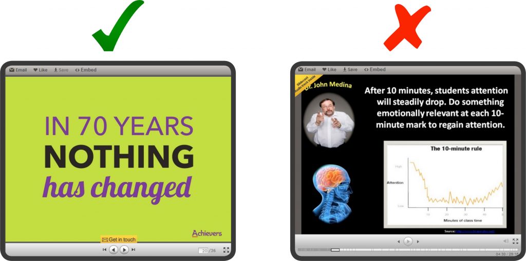
On the negative side, I find some of the illustrated comparisons to be unfair since they are not always pairing like with like. However, I cannot argue with the design logic presented by the authors.

Legibility, coordinating colour, aligning elements, and visual consistency should be familiar to anyone required to produce a decent illustrated Powerpoint presentation.
But perhaps the first two commandments gave me most pause for thought:
- Understanding the purpose of the content
- The need to establish a hierarchy
Valuable tips. And as stated above, they are the first, but possibly the easiest to overlook of all the 10 commandments mentioned.
I think the authors cover all the main points in this section.
Closing Comments
HubSpot’s book made me aware of the extent to which visual content creation is key to today’s digital marketing strategies. Indeed, I’ve noticed the most pleasing online experiences in terms of visual appeal and usability usually incorporate the author’s recommendations.
Additionally, I see their relevance not only to my current studies, but in future areas where digitalisation will reinforce and increase the implementation of these guidelines and practices.
In conclusion, the instructions and advice outlined in HubSpot’s book are concise and easily digestible, which I found engaging. This is quite an achievement for a tech-heavy subject area including media such as video, photography, infographics, and presentations.
Finally, the book’s design suggestions are holistic and not limited to marketing. Therefore, I would recommend it to anyone thinking of starting a blog or planning their own website.
What Are Your Thoughts?
Please comment if you have anything to share on this topic of the visual content creation for marketers book.
Sources
Johnson, S. & Franekl, K. 2022. Design It Yourself: The Marketer’s Crash Course in Visual Content Creation. HubSpot Publication. Ebook. Accessed 18 March 2022 https://cdn2.hubspot.net/hub/53/file-25210679-pdf/design_it_yourself_the_marketers_crash_course_in_vi.
Pine, J. B. & Gilmore, J. H. 2011. The Experience Economy. Updated Edition. Boston, Massachusetts: Harvard Business Review Press. Ebook. Accessed 18 March 2022 https://ebookcentral-proquest-com.ez.lapinamk.fi/lib/ulapland-ebooks/detail.action?docID=5181949.
Banner image © rawpixel
One Comment